TidyTuesday is a weekly data visualization challenge that I use as a creative and learning space. Each week, a new dataset is posted in the tidytuesday project’s github, which is organized by the Data Science Learning Community, and participants are invited to explore and visualize the data using R. For me, it’s an opportunity to experiment with new ideas, improve my coding and data-storytelling skills, and turn raw data into clear and engaging visuals.
I also often use these datasets in my classes, giving students the chance to explore and learn from in real-world data.
2025
Week 32
Show code
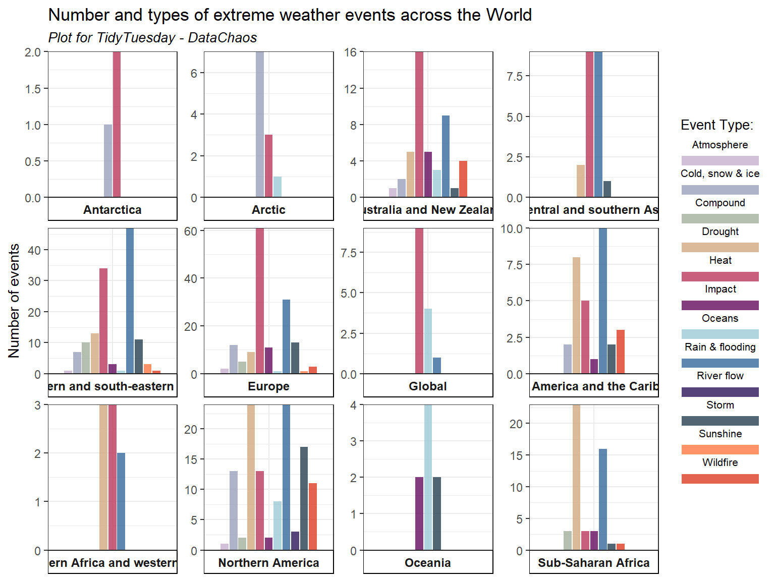
tuesdata <- tidytuesdayR::tt_load('2025-08-12')attribution_studies <- tuesdata$attribution_studieslibrary(tidyverse)atr_event <- attribution_studies %>%filter(study_focus =="Event")paleta <-c("#C5B0CD","#98A1BC","#A2AF9B", "#D1A980","#B9375D", "#640D5F","#9ECAD6", "#34699A", "#2A1458","#273F4F", "#FE7743", "#DC3C22")plot2 <-ggplot((filter(atr_event, cb_region !="Northern hemisphere")), aes(x=cb_region, fill=event_type))+geom_bar(stat="count", position=position_dodge2(preserve="single"), alpha=0.8)+labs(x ="Region", y ="Number of events", fill ="Event Type:",title ="Number and types of extreme weather events across the World",subtitle ="Plot for TidyTuesday - DataChaos") +facet_wrap(~cb_region, scales="free", strip.position="bottom")+scale_y_continuous(expand=c(0,0))+theme_bw()+scale_fill_manual(values=paleta)+guides(fill =guide_legend(label.position ="top"))+theme(axis.text.x =element_blank(),axis.title.x =element_blank(),#strip.placement = "outside",#legend.position = "bottom",strip.background.y =element_rect(fill ="white", color ="white"),strip.background.x =element_rect(fill ="white", color ="black"),strip.text.x =element_text(face="bold", size=9),legend.text =element_text(size =8),legend.title =element_text(size =10),legend.key.size =unit(0.3, "cm"),plot.subtitle =element_text(size=10, face="italic"),axis.ticks.x =element_blank())plot2
Option 2
Show code
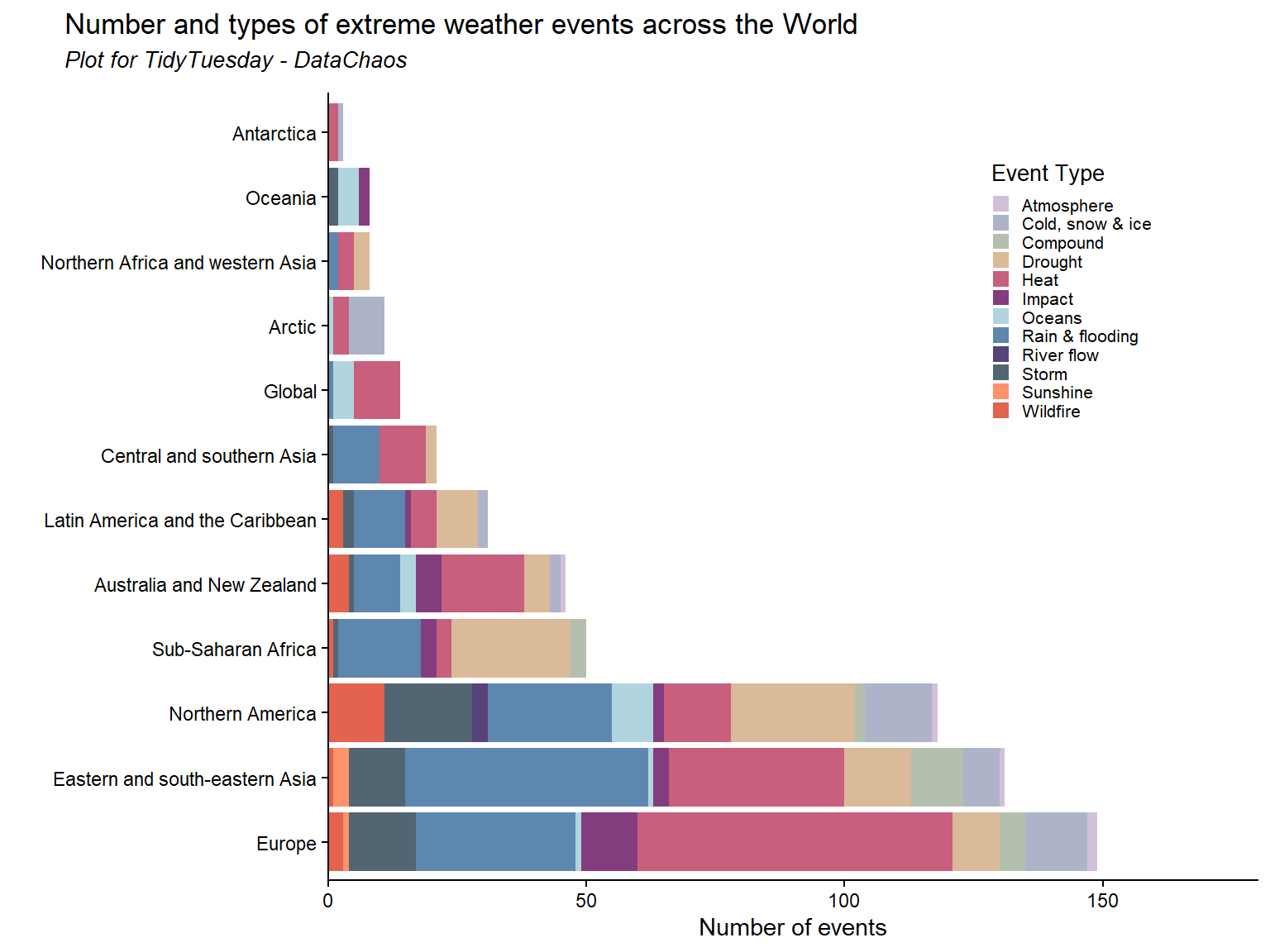
plot <-ggplot(filter(atr_event, cb_region !="Northern hemisphere")) +geom_bar(aes(x = forcats::fct_infreq(cb_region), fill = event_type), alpha=0.8) +labs(x =" ", y ="Number of events", fill ="Event Type", title ="Number and types of extreme weather events across the World",subtitle ="Plot for TidyTuesday - DataChaos") +scale_y_continuous(expand=c(0,0), limits=c(0,180))+theme_classic()+scale_fill_manual(values=paleta)+coord_flip()+theme(legend.position=c(0.8,0.75),legend.text =element_text(size =8),legend.title =element_text(size =10),legend.key.size =unit(0.3, "cm"),plot.title =element_text(margin =margin(l =-120,b=5, unit ="pt")),plot.subtitle =element_text(size=10, face="italic",margin =margin(l =-120,b=10, unit ="pt")))plot
Week 34
Show code
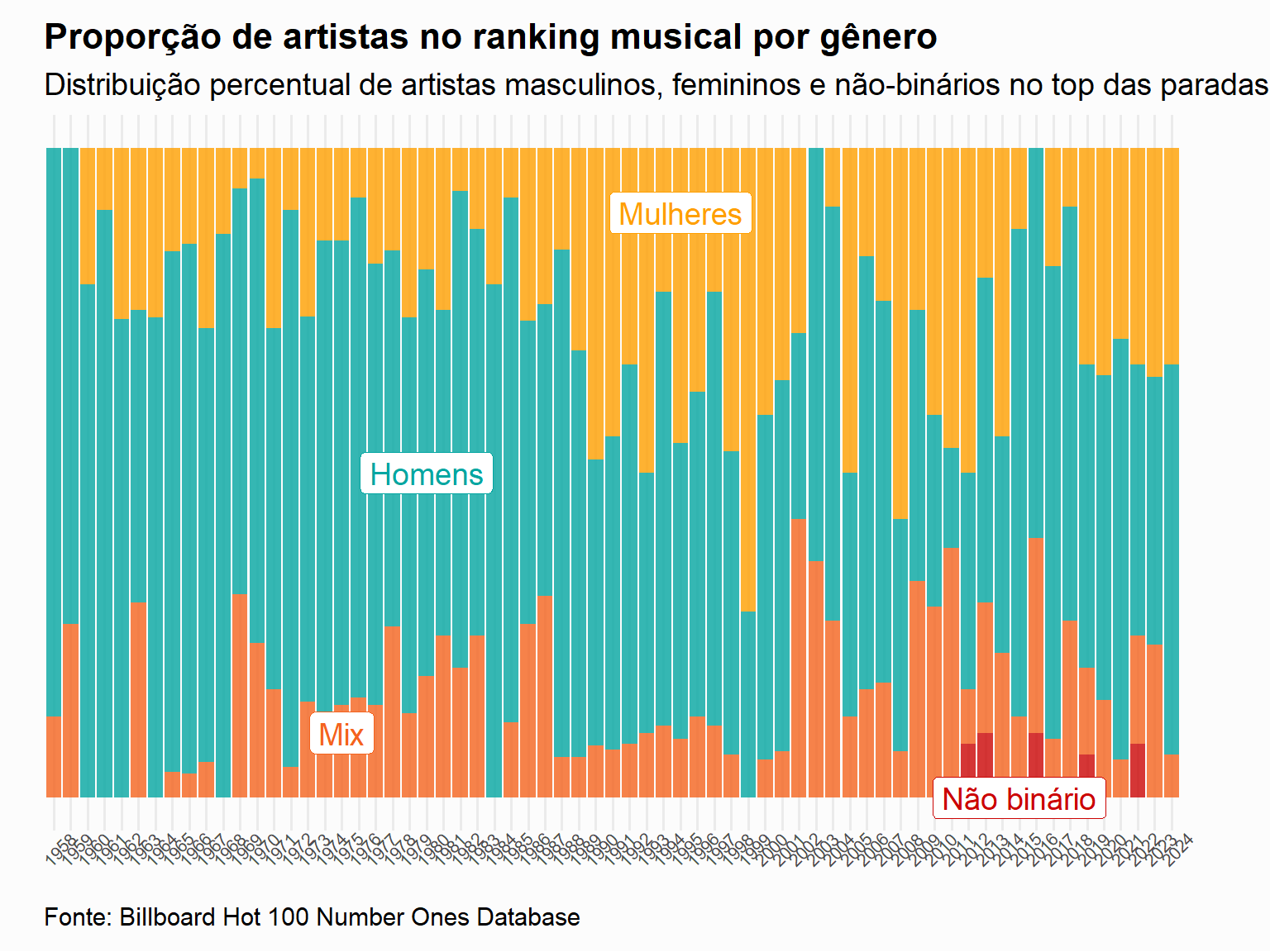
tuesdata <- tidytuesdayR::tt_load('2025-08-26')billboard <- tuesdata$billboardtopics <- tuesdata$topicsbillboard <- billboard %>%mutate(year =year(date)) %>%mutate(decade =factor(year %/%10*10))p1 <-ggplot(filter(billboard, year !="2025"), aes(x =factor(year), fill =factor(artist_male))) +geom_bar(position ="fill", alpha=0.8) +labs(x ="Ano", y ="Proporção de artistas", fill ="Gênero",title ="Proporção de artistas no ranking musical por gênero",subtitle =str_wrap("Distribuição percentual de artistas masculinos, femininos e não-binários no top das paradas musicais de 1958-2024", 140),caption ="Fonte: Billboard Hot 100 Number Ones Database") +scale_fill_manual(values=c("#FF9F00","#03A6A1","#F4631E", "#CB0404"), labels =c("Mulheres", "Homens", "Mix", "Não-binários")) +theme_minimal(base_size =14)+theme(axis.text.x =element_text(angle=45, vjust=1, size=8),legend.position ="none",plot.background =element_rect(fill ="grey99", color =NA),axis.title =element_blank(),axis.text.y =element_blank(),panel.grid.major.y =element_blank(),panel.grid.minor.y =element_blank(),plot.title =element_text(face ="bold", size =16),plot.subtitle =element_text(lineheight =1),plot.caption =element_text(margin =margin(10, 0, 0, 0), hjust =0),plot.margin =margin(10, 40, 10, 20))+annotate(geom ="label", x="1995", y =0.9, label ="Mulheres", fill="white", color="#FF9F00")+annotate(geom ="label", x="1980", y =0.5, label ="Homens", fill="white", color="#03A6A1")+annotate(geom ="label", x="1975", y =0.1, label ="Mix", fill="white", color="#F4631E")+annotate(geom ="label", x="2015", y =0, label ="Não binário", fill="white", color="#CB0404")p1
Show code
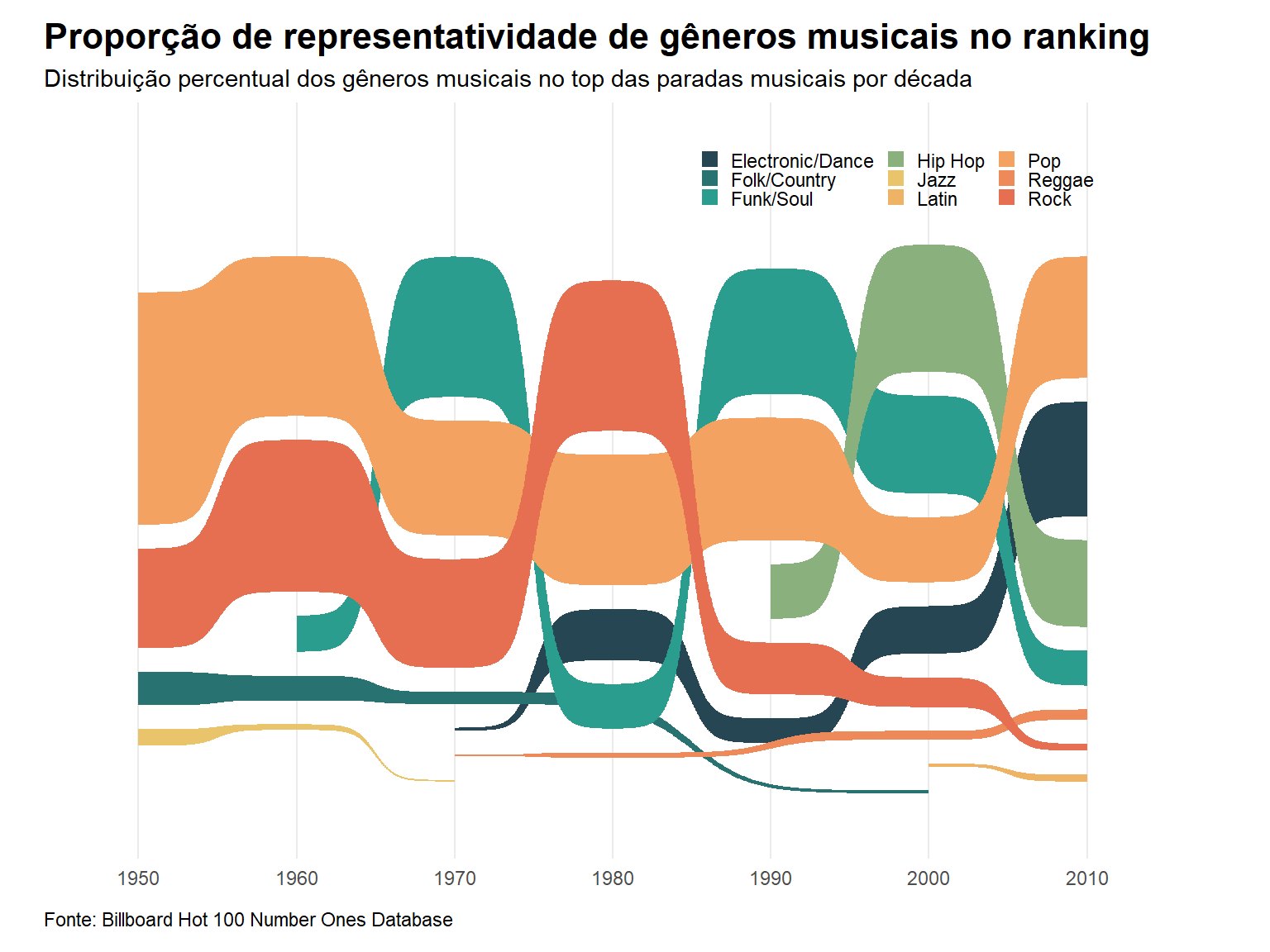
sankey.data <- billboard %>%select(year,decade, cdr_genre, songwriter_male, artist_male, songwriter_white, artist_white) %>%mutate(songwriter_gender =case_when(songwriter_male ==0~"Mulher", songwriter_male ==1~"Homem", songwriter_male ==2~"Mix", songwriter_male ==3~"Não-binário"),artist_gender =case_when(artist_male ==0~"Mulher", artist_male ==1~"Homem", artist_male ==2~"Mix", artist_male ==3~"Não-binário"),songrwriter_race =case_when(songwriter_white ==0~"Não branco", songwriter_white ==1~"Branco", songwriter_white ==2~"Mix"),artist_race =case_when(artist_white ==0~"Não branco", artist_white ==1~"Branco", artist_white ==2~"Mix"))library(ggsankey)sankey.data.flow <-na.omit(sankey.data) %>%mutate(cdr_genre =str_remove(cdr_genre, ";.*")) %>%group_by(decade) %>%mutate(decade_n =n()) %>%ungroup() %>%group_by(decade, cdr_genre) %>%summarise(n =n(), decade_n, prop = n / decade_n) %>%distinct()pal <-c("#264653","#287271", "#2a9d8f", "#8ab17d", "#e9c46a", "#efb366","#f4a261","#ee8959","#e76f51")p2 <-ggplot(sankey.data.flow, aes(x = decade, node = cdr_genre, fill = cdr_genre, value = prop, label = cdr_genre)) +geom_sankey_bump() +scale_fill_manual(values=pal)+labs( title ="Proporção de representatividade de gêneros musicais no ranking",subtitle =str_wrap("Distribuição percentual dos gêneros musicais no top das paradas musicais por década", 140),caption ="Fonte: Billboard Hot 100 Number Ones Database") +theme_minimal() +ylim(-0.8,1)+guides(fill =guide_legend(nrow =3))+theme(legend.title =element_blank(),axis.title =element_blank(),axis.text.y =element_blank(),legend.position =c(0.75,0.9),panel.background =element_rect(fill ="transparent", color =NA),plot.background =element_rect(fill ="transparent", color =NA),panel.grid.major.y =element_blank(),panel.grid.minor.y =element_blank(),plot.title =element_text(face ="bold", size =16),plot.subtitle =element_text(lineheight =1),plot.caption =element_text(margin =margin(10, 0, 0, 0), hjust =0),plot.margin =margin(10, 40, 10, 20),legend.key.size =unit(0.3, "cm"))p2
Week 36
Show code
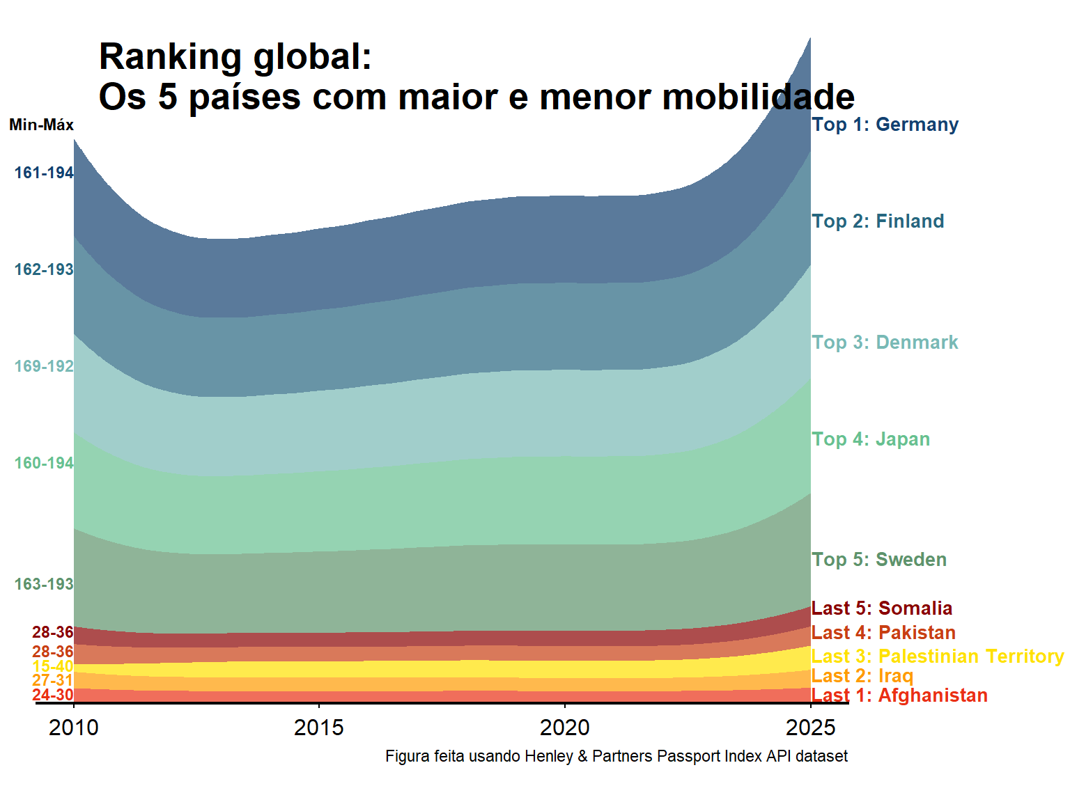
tuesdata <- tidytuesdayR::tt_load('2025-09-09')rank_by_year <- tuesdata$rank_by_yearlowest.rank <- rank_by_year %>%group_by(country) %>%summarise_if(is.numeric, mean) %>%slice_max(order_by = rank, n =5)lowest <- rank_by_year %>%filter(country %in% lowest.rank$country)highest.rank <- rank_by_year %>%group_by(country) %>%summarise_if(is.numeric, mean) %>%slice_min(order_by = rank, n =5)highest <- rank_by_year %>%filter(country %in% highest.rank$country)toplow <- lowest %>%full_join(highest)library(ggridges)toplow$country <-factor(toplow$country, levels=c("Afghanistan","Iraq","Palestinian Territory","Pakistan","Somalia","Sweden","Japan","Denmark","Finland","Germany"))library(forcats)library(ggstream)toplow$country <-fct_rev(toplow$country)paleta <-c("#124170", "#26667F","#78B9B5", "#67C090", "#5E936C", "#8A0000", "#C83F12","#FFE100","#FF9B00", "#EA2F14")plot <-ggplot(filter(toplow, year>=2010), aes(year, visa_free_count, fill = country)) +geom_stream(type ="ridge" ,bw=1, alpha=0.7)+scale_fill_manual(values=paleta) +scale_y_continuous(expand =c(0,0)) +scale_x_continuous(breaks=c(2010,2015,2020,2025),labels =c("2010","2015","2020","2025")) +coord_cartesian(clip ="off") +theme_classic()+labs(caption ="Figura feita usando Henley & Partners Passport Index API dataset")+theme(axis.title =element_blank(), axis.line.x=element_line(linewidth =0.75),axis.line.y=element_blank(),axis.ticks.y=element_blank(),plot.margin =margin(20,120,20,20),legend.position="none",panel.grid =element_blank(),axis.text.y=element_blank(),axis.text.x =element_text(size=12,margin =margin(5,0,0,0)))+annotate("text", x =2025, y =c(1200, 1000, 750,550,300,200,150,100,60,20),label =c("Top 1: Germany","Top 2: Finland","Top 3: Denmark","Top 4: Japan","Top 5: Sweden","Last 5: Somalia","Last 4: Pakistan","Last 3: Palestinian Territory","Last 2: Iraq","Last 1: Afghanistan"),hjust=0,size=3.5,lineheight=.8,fontface="bold",color=paleta)+annotate("text", x =2010.5, y =1300,label ="Ranking global:\nOs 5 países com maior e menor mobilidade",hjust=0,size=7,lineheight=.9,fontface="bold",color="black")+annotate("text", x =2010, y =c(1200, 1100,900, 700,500,250,150,110,80,50,20),label =c("Min-Máx","161-194","162-193","169-192","160-194","163-193","28-36","28-36","15-40","27-31","24-30"),hjust=1,size=3,lineheight=.8,fontface="bold", color=c("black","#124170", "#26667F","#78B9B5", "#67C090", "#5E936C", "#8A0000", "#C83F12","#FFE100","#FF9B00", "#EA2F14"))plot
Week 39
Show code
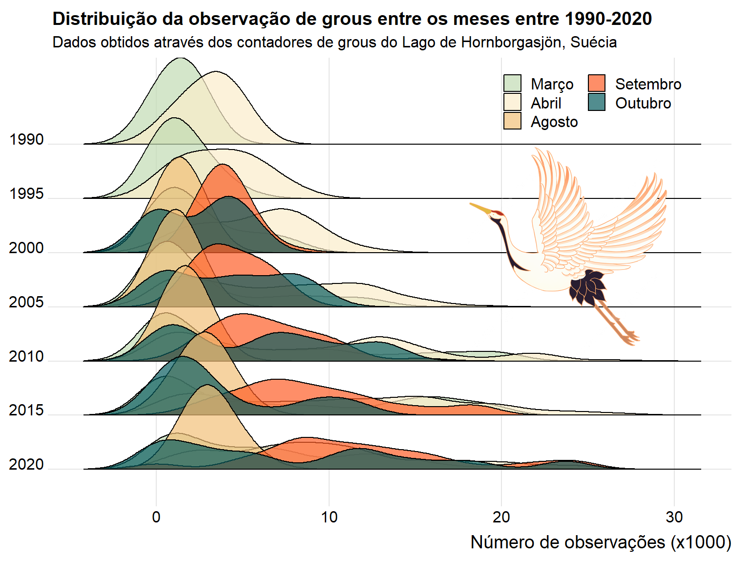
tuesdata <- tidytuesdayR::tt_load('2025-09-30')cranes <- tuesdata$cranescranes <- cranes %>%mutate(year =year(date)) %>%mutate(interval =factor(year %/%5*5)) %>%mutate(month =month(date))library(ggridges)cranes_clean <- cranes %>%filter(!is.na(observations)) library(png)library(grid)crane_png <-readPNG("crane.png")crane_grob <-rasterGrob(crane_png, interpolate =TRUE)final <-ggplot(cranes_clean, aes(x=observations/1000, fill=as.factor(month), y=fct_rev(interval))) +geom_density_ridges2(alpha=0.7)+labs(x ="Número de observações (x1000)",y ="Intervalos",title ="Distribuição da observação de grous entre os meses entre 1990-2020",subtitle ="Dados obtidos através dos contadores de grous do Lago de Hornborgasjön, Suécia" ) +scale_fill_manual(values=c("#C1DBB3","#FAEDCA", "#F2C078","#FE5D26", "#075B5E"),labels =c("Março", "Abril", "Agosto", "Setembro", "Outubro"),name ="Mês")+theme_ridges()+guides(fill=guide_legend(ncol=2))+theme(legend.position =c(0.65,0.9), legend.title =element_blank(),axis.title.y =element_blank())+annotation_custom(crane_grob, xmin=17, xmax=30, ymin="2010", ymax="1990")final
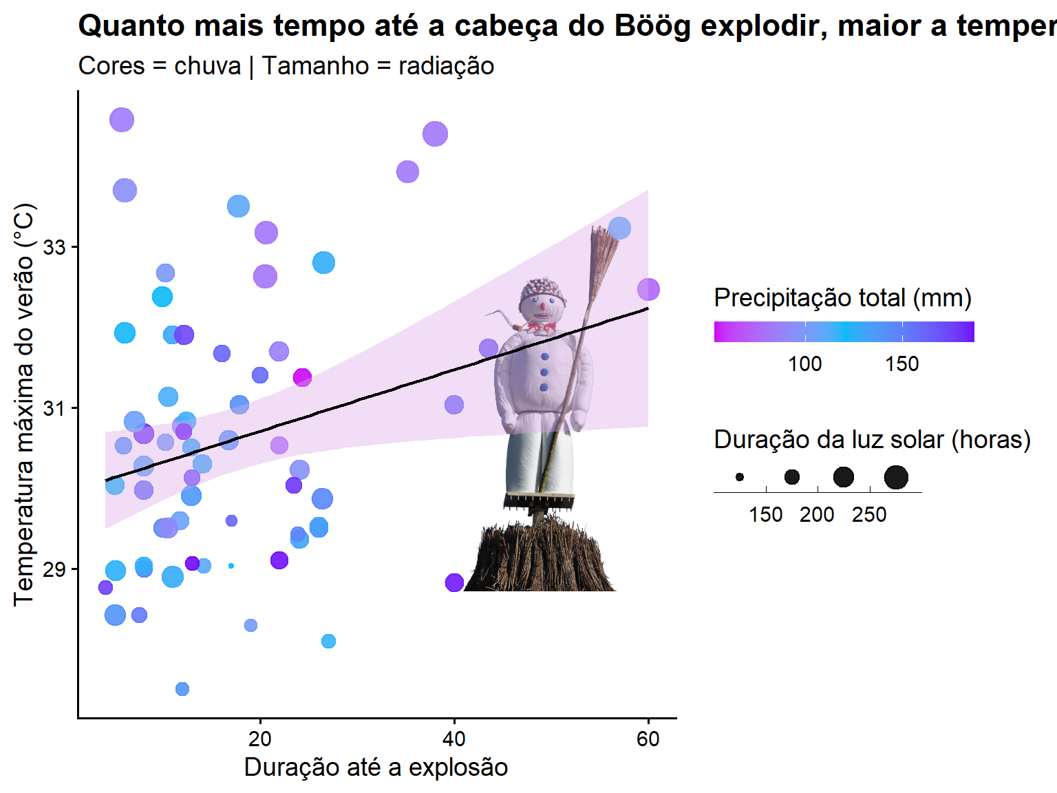
Call:
lm(formula = tre200mx ~ duration, data = sech)

Residuals:
    Min      1Q  Median      3Q     Max
-2.9004 -1.2478 -0.1033  0.7868  4.4100

Coefficients:
            Estimate Std. Error t value Pr(>|t|)
(Intercept) 29.94258    0.35572  84.175   <2e-16 ***
duration     0.03815    0.01677   2.275   0.0263 *
---
Signif. codes:  0 '***' 0.001 '**' 0.01 '*' 0.05 '.' 0.1 ' ' 1

Residual standard error: 1.593 on 63 degrees of freedom
  (2 observations deleted due to missingness)
Multiple R-squared:  0.07591,   Adjusted R-squared:  0.06124
F-statistic: 5.175 on 1 and 63 DF,  p-value: 0.02632
Show code
library(png)library(grid)img <-readPNG("boog.png")g <-rasterGrob(img, interpolate =TRUE)plot <-ggplot(sech, aes(duration,tre200mx))+annotation_custom(g, xmin =40, xmax =68,ymin =27, ymax =35)+geom_point(aes(colour=rre150m0, size=sre000m0), alpha =0.9)+geom_smooth(method="lm", se =TRUE,colour ="black",fill="#DCA9E8",linewidth =0.8)+labs(x="Duração até a explosão", y="Temperatura máxima do verão (°C)",title ="Quanto mais tempo até a cabeça do Böög explodir, maior a temperatura do verão",subtitle ="Cores = chuva | Tamanho = radiação")+scale_size_continuous(name ="Duração da luz solar (horas)",guide =guide_bins(direction ="horizontal",barheight =unit(4, "mm"),barwidth =unit(10, "mm"),title.position ="top"))+scale_color_gradient2(low ="#CC07FA", high ="#7007FA", mid ="#07B9FA", midpoint =120,name ="Precipitação total (mm)",guide =guide_colorbar(direction ="horizontal",barheight =unit(4, "mm"),barwidth =unit(50, "mm"),title.position ="top")) +theme_classic(base_size =14) +theme(plot.title =element_text(face ="bold"),legend.position ="right")plot